All features

Website builder

A website builder that feels like rearranging a tidy room.

26 industry templates, 11 design directions and sections for almost everything. Click any text to style it, double-click to type, and watch desktop, tablet and phone update together.

A website made with the builder, on a phone

Real screenshots from the builder, using demo sites.

How it works

Three steps, no surprises

  1. 1

    Start from a look you love

    Pick a template for your industry and a design direction — Luxury, Glass, Editorial, Playful and more.

  2. 2

    Make it yours

    Click to edit words, swap photos, add sections from the gallery, tweak spacing and colours down to the pixel.

  3. 3

    Check and publish

    We review accessibility, SEO and broken links before anything goes live — then publish in one click.

The tour

Every tool, up close.

  1. 01Edit on the page

    Click anything. Change anything.

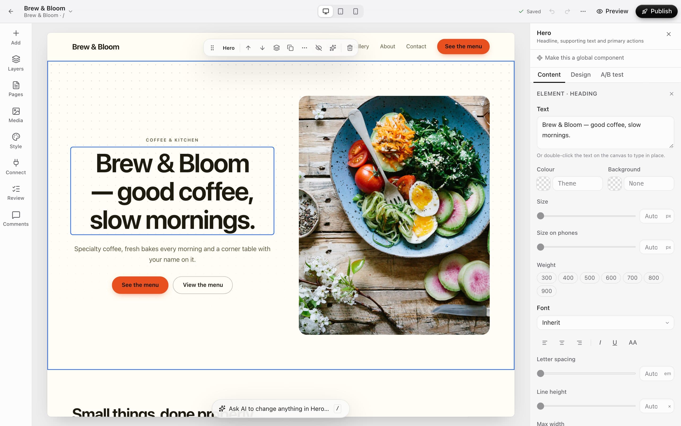
    Select a section, then any heading, button or image inside it. The inspector shows exactly what you can change — no hunting through menus.

    • Double-click any text to type in place
    • Colour, size, weight, font and spacing per element
    • A separate text size for phones
    • Undo and redo for every change
    A selected heading on the canvas with its style options in the inspector
  2. 02Sections

    A ready-made section for almost everything.

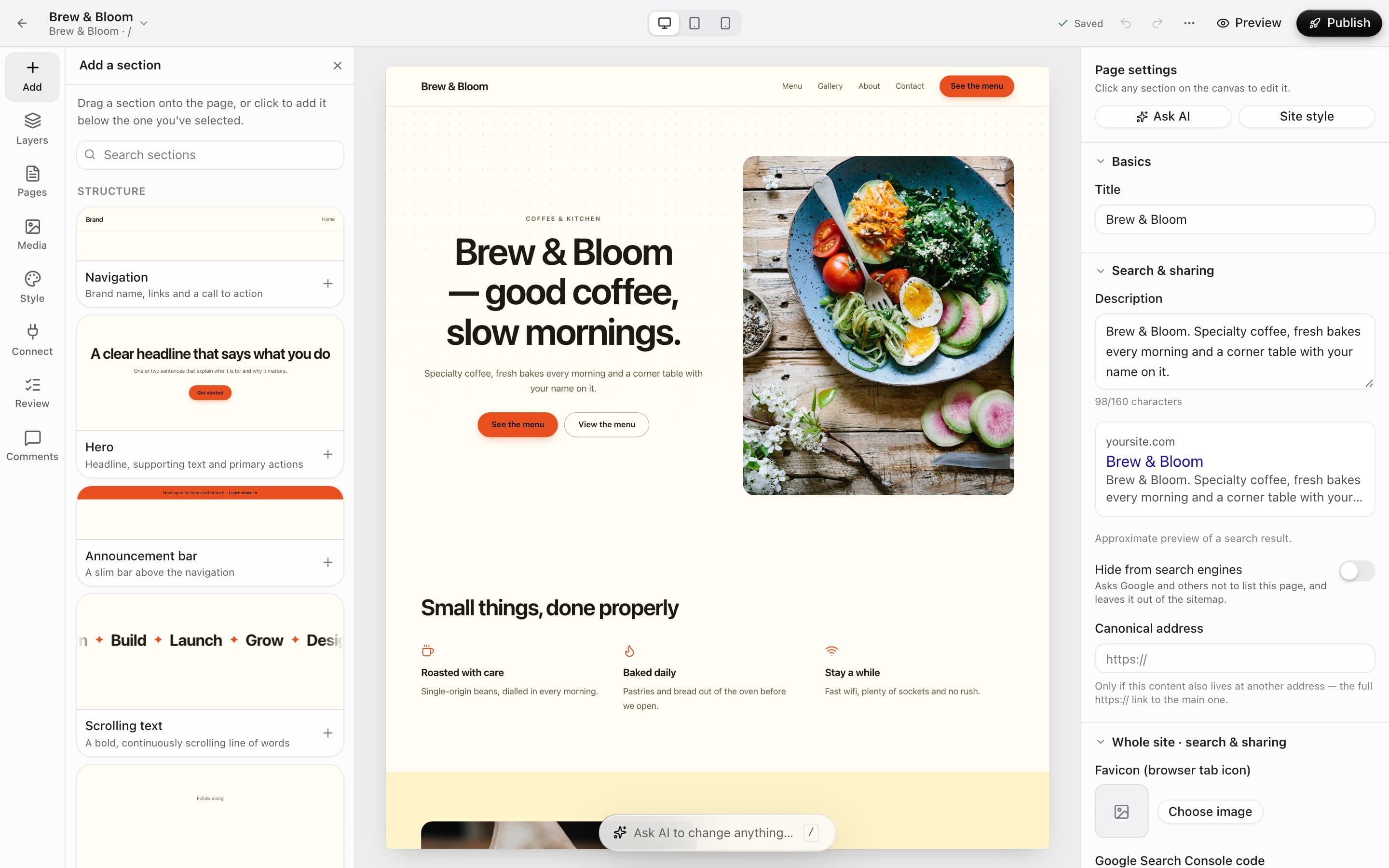
    Navigation, heroes, menus, galleries, FAQs, bookings, forms and more — each previewed live in your own colours and fonts before you add it.

    • Live previews in your site's style
    • Search by name
    • Reorder by dragging, or Alt + ↑/↓ on the keyboard
    The Add a section panel with live previews of navigation, hero and announcement sections
  3. 03Design direction

    Change the whole feel in one click.

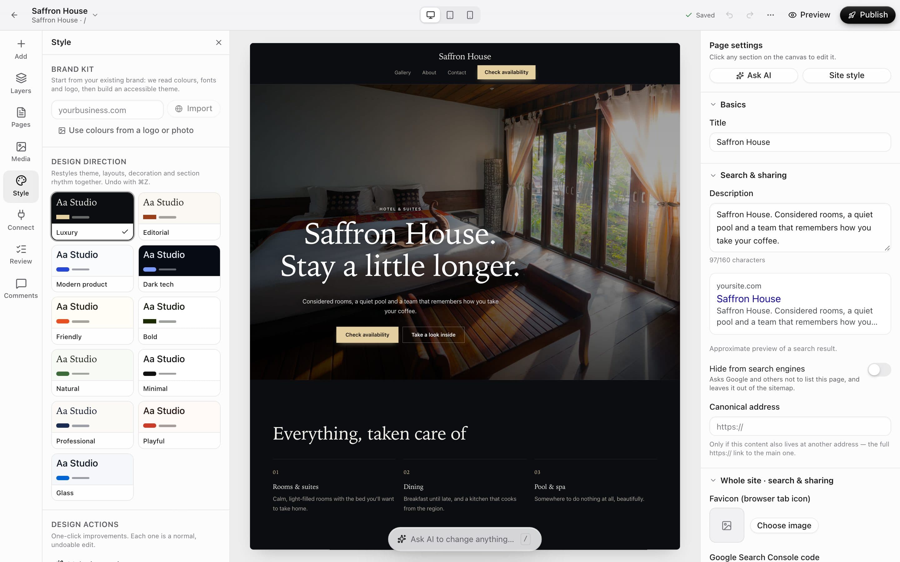
    Pick a direction and the theme, layouts and spacing restyle together. Start from your existing brand and we build an accessible theme around it.

    • 11 directions — Luxury, Editorial, Bold, Playful and more
    • Import colours and fonts from your website, logo or a photo
    • One-click actions like “Make it premium” or “Simplify”
    • Every change undoes in one step
    The Style panel with design directions; Luxury is applied to a hotel homepage
  4. 04Every screen

    Looks right on phones, without a second site.

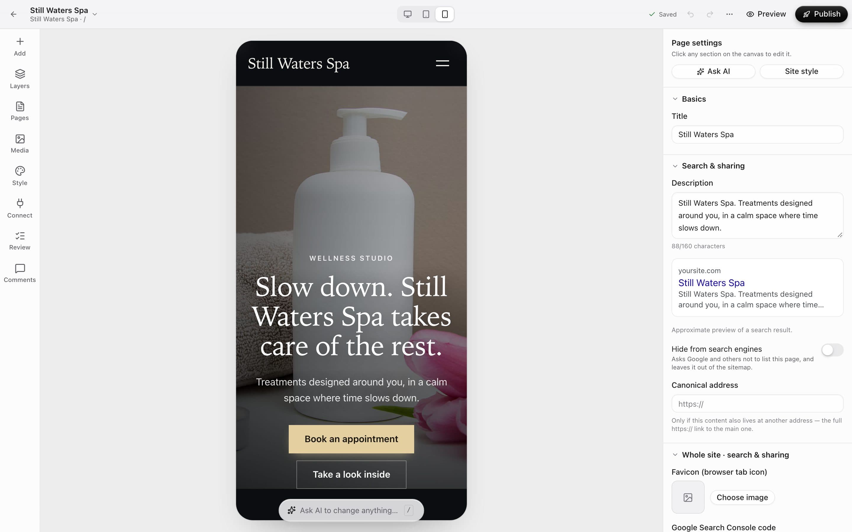
    Switch between desktop, tablet and phone while you edit. Sections rearrange themselves, and you fine-tune anything that needs it.

    • Desktop, tablet and phone previews
    • Phone-only text sizes and spacing
    • Hide a section on one screen size
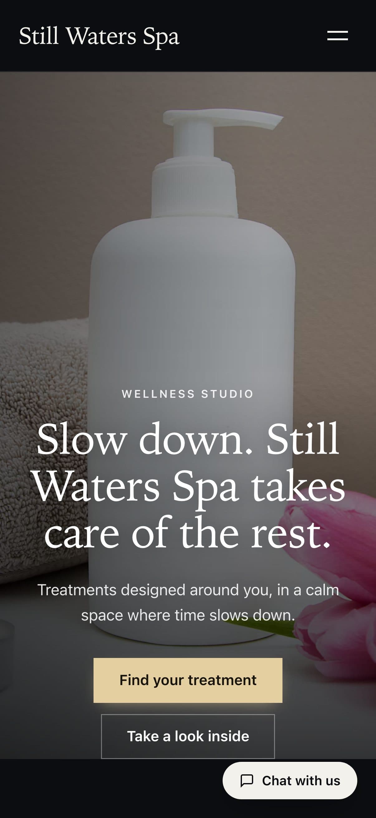
    A spa homepage shown in the builder's phone preview
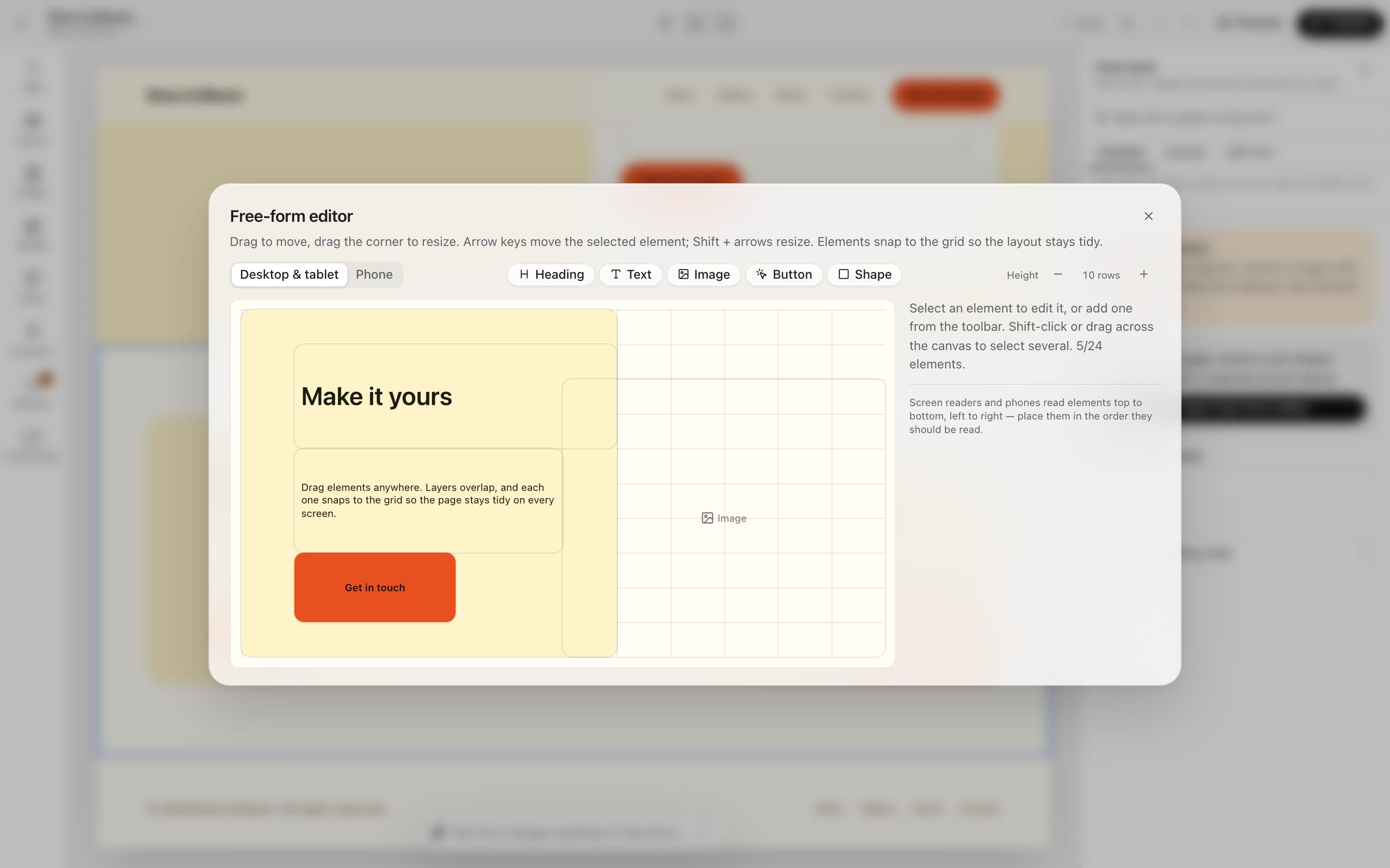
  5. 05Free-form

    Place things exactly where you want them.

    When a section needs to break the mould, open the free-form editor: drag, overlap and resize on a grid that keeps everything tidy.

    • Headings, text, images, buttons and shapes
    • A separate layout for phones
    • Arrow keys move, Shift + arrows resize
    The free-form editor with a heading, text, button and image placed on a grid
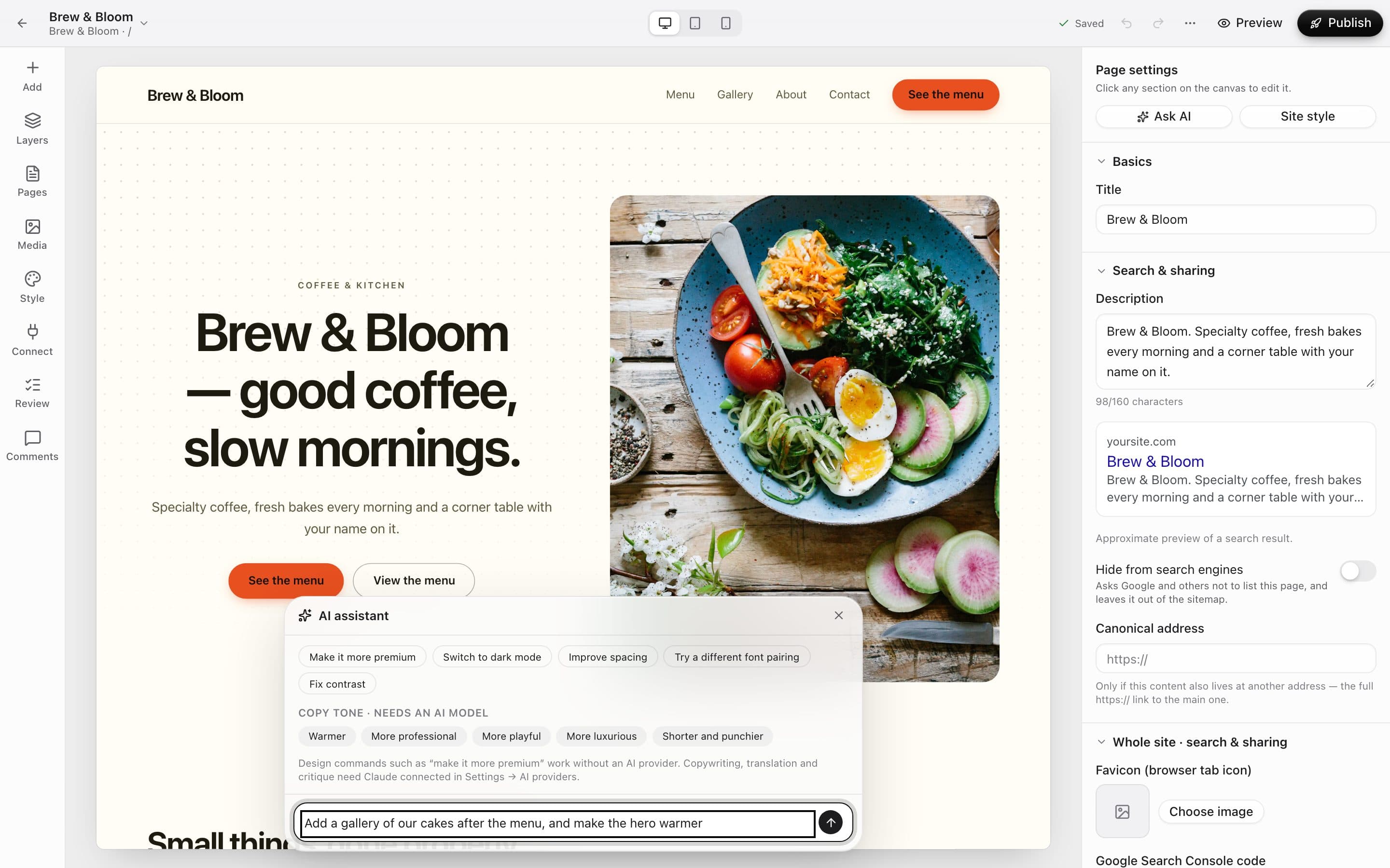
  6. 06AI assistant

    Or just ask for what you want.

    Type a change in plain words, or tap a suggestion. Design commands like “make it more premium” work out of the box.

    • Quick design commands work with no AI provider
    • Copy tone, translation and critique use Claude once it's connected in Settings
    • Select a section first to keep changes to just that part
    The AI assistant open over a café homepage, with suggestion chips and a typed request
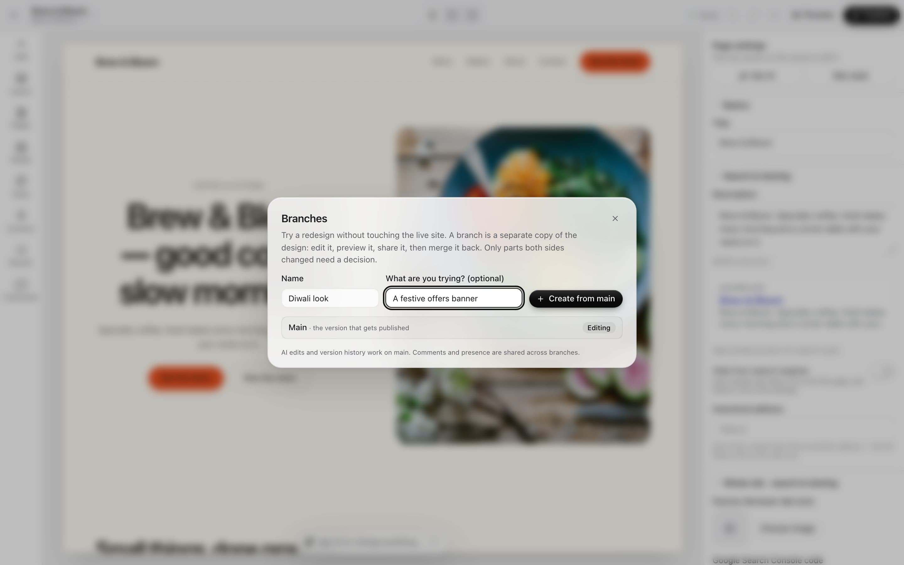
  7. 07Versions & branches

    Try a redesign without touching the live site.

    Every save is a version you can restore. For bigger ideas, start a branch: edit it, preview it, share it, then merge it back.

    • Full version history
    • Branches you can preview and share
    • When merging, only parts both sides changed need a decision
    The Branches dialog creating a branch called Diwali look
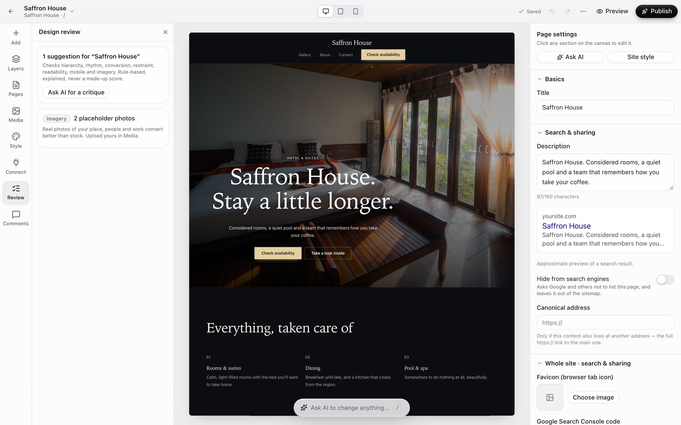
  8. 08Design review

    A second pair of eyes before you publish.

    The review checks hierarchy, rhythm, readability, mobile and imagery — and explains every suggestion. Rule-based, never a made-up score.

    • Explained, fixable suggestions
    • Flags placeholder photos to swap for your own
    • Ask AI for a deeper critique
    The Design review panel suggesting to replace two placeholder photos on a hotel homepage

In detail

What you get with Website builder

Edit right on the page

Click any heading or button to style it — colour, size, weight, spacing, shadow. Double-click to type in place.

Good to know

We'd rather be upfront than surprise you later:

  • Published sites stay fast and locked down: the only script they run is the small, first-party one behind pop-ups and countdowns (Promotions) — nothing else can execute.
  • AI features (translation, edits by instruction) need an AI provider key connected in Settings.

Questions people ask

Will it look good on phones?+

Yes — every section is responsive, and you can set phone-specific spacing and visibility. Preview all three sizes side by side.

Can a developer still touch the code?+

Absolutely. The same project opens in the AI code editor, with the design document and every file.

Can I undo a mistake?+

Undo, redo and full version history — restore any earlier version in a click.

Works beautifully with

Give it a spin — it's free to start.

Next up: Online store →

Start free